Reading Experiment Results on the Dashboard
What's experimentation without understanding the results and data behind them? In the Experiment Results section in any of your Taplytics experiments, this is where you'll see the Goals had previously created and how are performing.
Once you have an experiment running, it is displayed under your "Active Experiments." To see the results, just click on the experiment name.
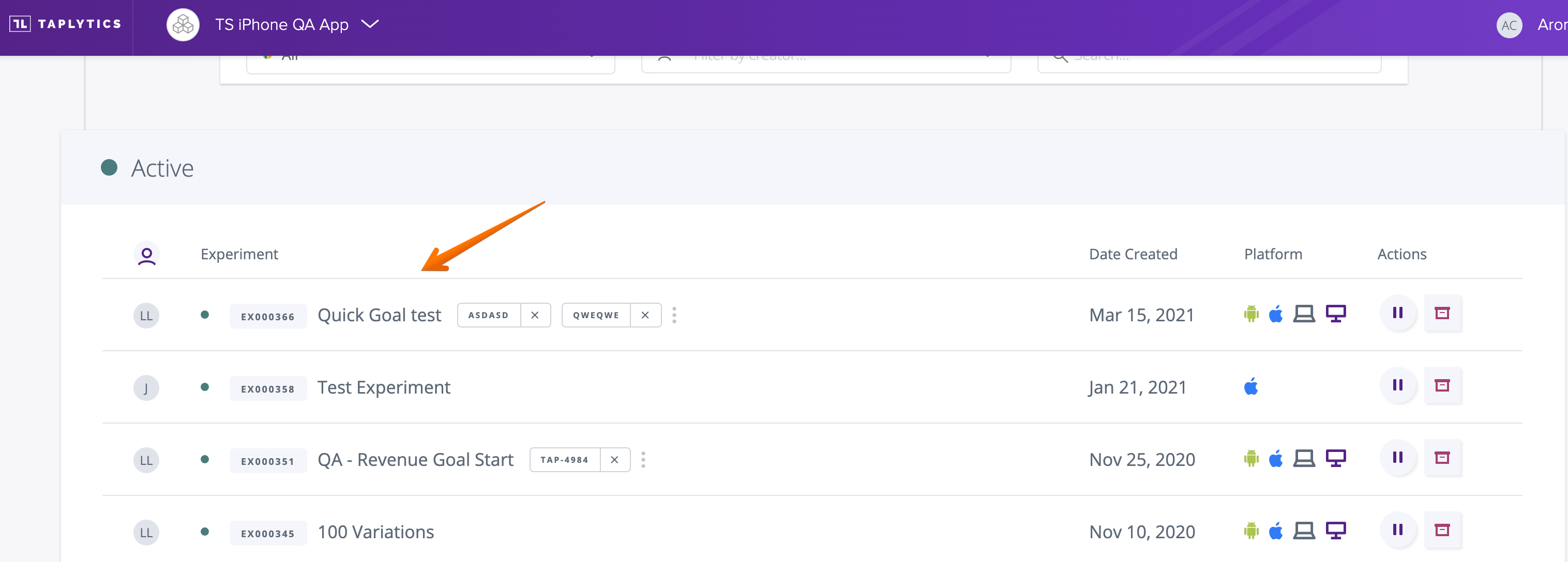
Understanding Your Experiment Data
When you hop into the "Results" page for the first time, there probably won't be much there. You'll likely see something that looks like this:

Don't worry about the lack of numbers. You've only had your experiment running for a few minutes. After a while, your "Results" page will start to look more like this:
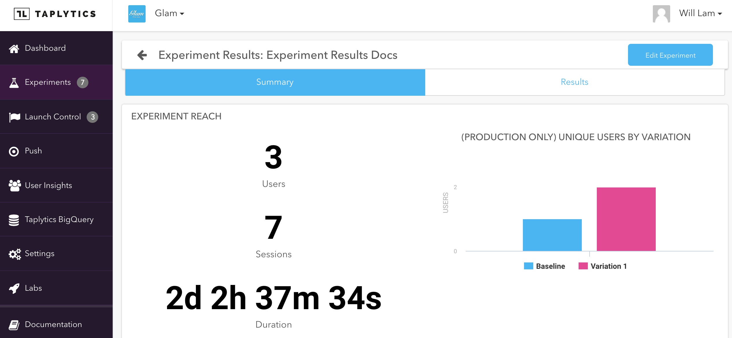
As qualified users are being exposed to the experiment and are bucketed into it, you'll start to see high level stats on the Summary Tab which highlights the total number of users in the experiment, the aggregate sessions, and the amount of time that has elapse. To its right, you'll see the exact break down of how many users are assigned to each variation as you mouse over the "Baseline" and "Variation" bar charts.
To view the performance of each variation, you can click on the Results tab to see the breakdown.
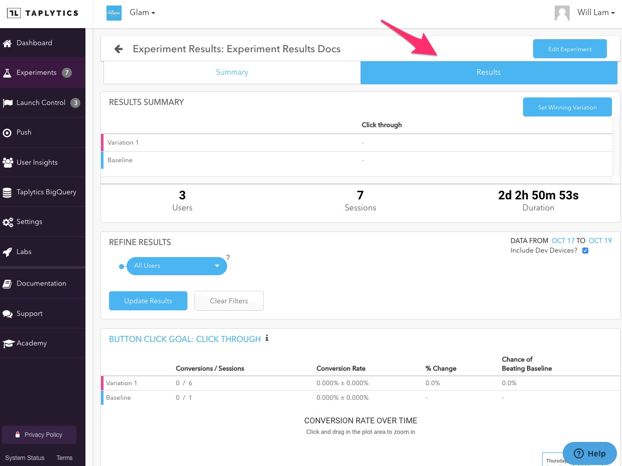
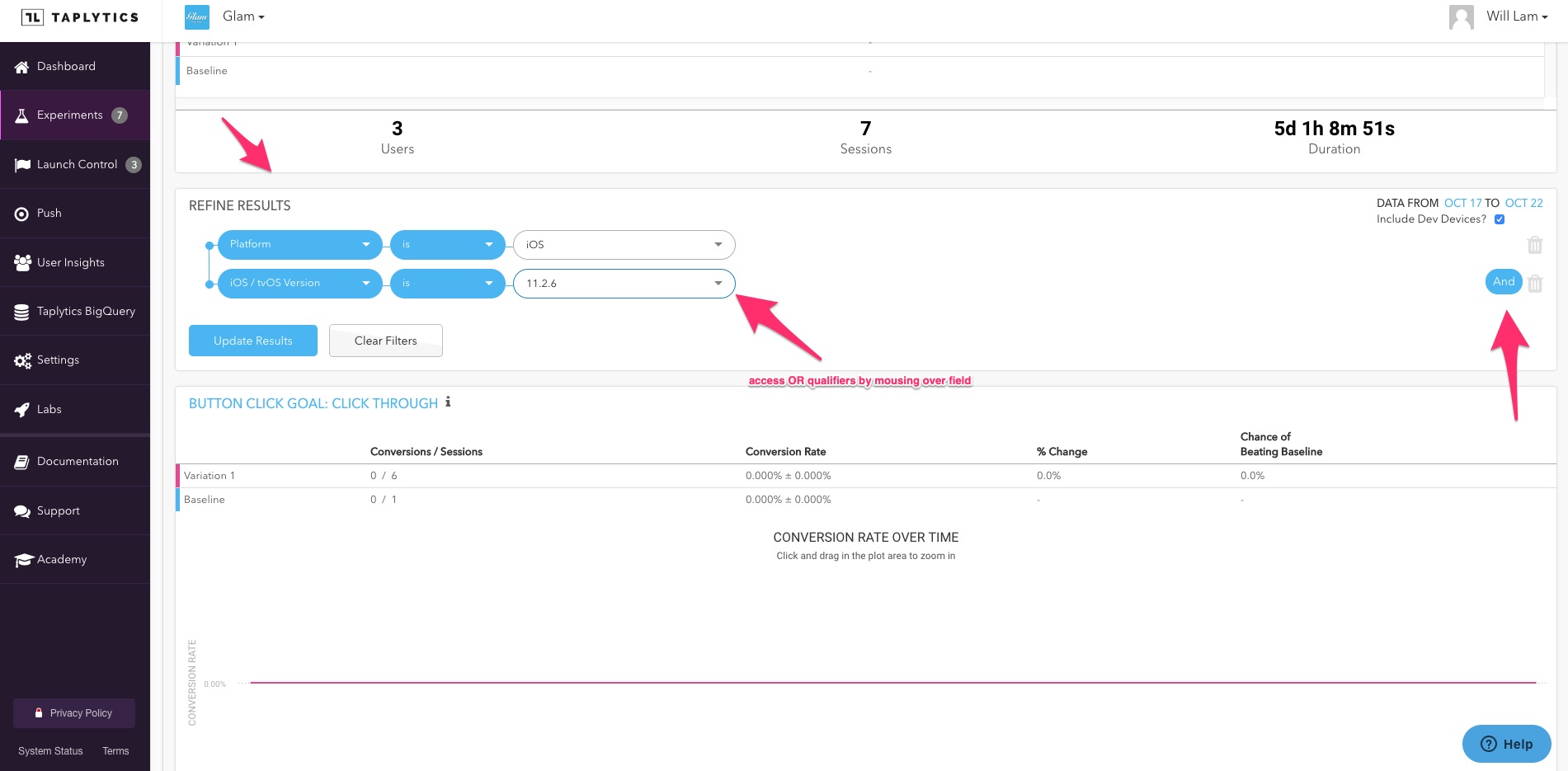
If you want to Refine your results and focus on a specific sub-segment of users who are bucketed into the experiment by toggling the filters in the drop down menu.
You can also be more granular by using AND and OR qualifiers.
For each goal that you set up, Taplytics shows you a exact breakdown of each goal performed according to variation. Here, you can see the total conversions, the percentage conversions (and the range that this should fall within in the future), the percentage change vs. the baseline, and the overall chance of beating the baseline. We also tell you if you have reached statistical significance or how much longer the experiment needs to run to achieve it.
Once Chance of Beating Baseline hits 100%, you've reached statistical significance.
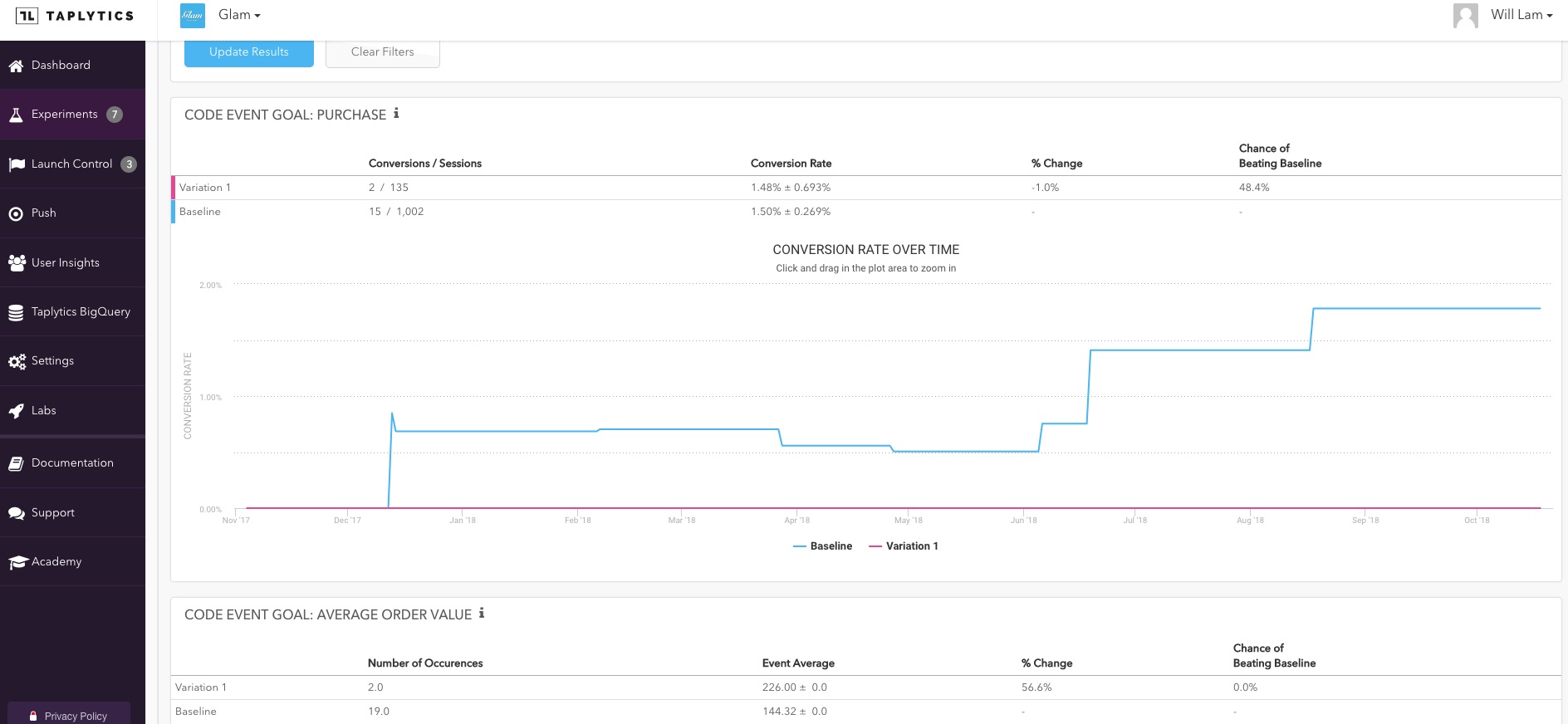
Beyond the hard numbers, we also give you a graphical representation of the data in the form of a line chart. The chart defaults to a view of the entire timeline of the experiment's life, but you can focus in on any area with the scroll bar at the bottom.
Updated over 4 years ago
